Lorem ipsum dolor sit amet, consectetur adipiscing elit.
Etiam volutpat nunc nibh, in tincidunt lorem pulvinar eu. Cras laoreet lacinia magna, in accumsan ipsum porta vel. Vestibulum non lorem non ex varius condimentum nec.
September 23, 2026
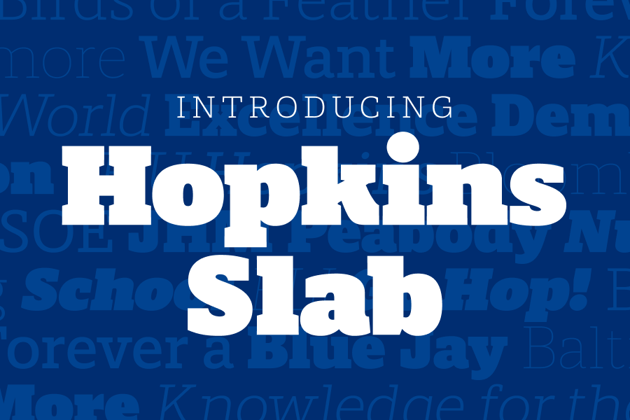
new slab serif typeface, designed by University Communications’ Sara Austin, Sr. Graphic Designer, includes a broad range of weights, from Hairline to Ultra, alternative glyphs, and italics (obliques, technically, for the font nerds reading this).
As a quick refresher, in September 2025, the university’s brand guidelines were updated to introduce open-source typefaces into our identity, including Work Sans, Roboto Slab, Source Serif 4, and Oswald. (Read the original blog post announcement.) At the same time, we began the process of retiring our now-legacy licensed typefaces, Gentona, Quadon, Titling Gothic, and Arnhem. This transition process from licensed to open-source typefaces is taking place in two phases, with the promise of a proprietary slab serif typeface being introduced in Phase Two. This will ultimately serve as our brand’s slab serif typeface, replacing Quadon, which was the toughest typeface to replace with open-source options.
Etiam volutpat nunc nibh, in tincidunt lorem pulvinar eu. Cras laoreet lacinia magna, in accumsan ipsum porta vel. Vestibulum non lorem non ex varius condimentum nec.
Etiam volutpat nunc nibh, in tincidunt lorem pulvinar eu. Cras laoreet lacinia magna, in accumsan ipsum porta vel. Vestibulum non lorem non ex varius condimentum nec.
Fusce lectus ipsum, rutrum id gravida et, facilisis at turpis. Donec quis eleifend nisi.
Fusce lectus ipsum, rutrum id gravida et, facilisis at turpis. Donec quis eleifend nisi.
Fusce lectus ipsum, rutrum id gravida et, facilisis at turpis. Donec quis eleifend nisi.
Proin dignissim, nisl sit amet consequat tristique, nisi ligula ultricies dolor.
Proin dignissim, nisl sit amet consequat tristique, nisi ligula ultricies dolor.
Proin dignissim, nisl sit amet consequat tristique, nisi ligula ultricies dolor.
Proin dignissim, nisl sit amet consequat tristique, nisi ligula ultricies dolor.
Now that we’re all caught up, let’s get into the details of Hopkins Slab—what it is, why we need it, and how it should be used.

Hopkins Slab, a slab serif display typeface, is proprietary to Johns Hopkins University. This means the typeface was custom designed for us, based on our brand personality and visual identity. It’s owned by Johns Hopkins University and is not available for use by the public or our peers, which sets us apart from competitors by adding to our unique visual identity.
Designed with visually similar proportions to our original licensed typeface, Quadon, Hopkins Slab expands on the weight range offered by Quadon and rounds out the typeface to broaden the appeal and friendliness. Hopkins Slab was designed with Hopkins-specific use cases in mind and tested with our most common words and phrases, such as blue jays, JHU, community, research, campus, knowledge, and more.

Proprietary (and open-source) typefaces help businesses save money in the long run, avoiding costly contracts and licensing fees from font foundries. We are joining a number of prominent businesses and universities in this brand strategy, including Apple, Uber, Walmart, Netflix, Yale University, Syracuse University, and the University of Michigan.
So, you might be wondering, why aren’t all of our brand typefaces proprietary? We certainly love the sound of that, but the process for creating a proprietary typeface is lengthy and can be expensive upfront if external resources are needed.
Typeface design is a specialty within the creative world—it typically requires specific and rigorous schooling to learn the ins and outs and perfect the craft. Lucky for us at Johns Hopkins, one of our senior graphic designers on the University Communications team, Sara Austin, recently earned her post-graduate certificate in typeface design from The Cooper Union’s Extended Program. On top of her book of work supporting creative and branding needs across Student Affairs and the university, Sara was able to put her talent for typeface design to great use over the past year, creating Hopkins Slab.
And while the possibilities and appetite for future proprietary typefaces are endless and exciting, right now we are focusing on the integration of Hopkins Slab into our brand and completing the transition from licensed to open-source typefaces.
On the topic of Hopkins Slab integration, here are the next steps you should take:
Over the next few weeks, you’ll receive additional communications via the Brand Jays newsletter regarding steps to integrate Hopkins Slab on JHU websites and template tools, like Marq and Canva. Keep an eye out for those!
As you start to work with Hopkins Slab, here are a few tips for getting the best results:

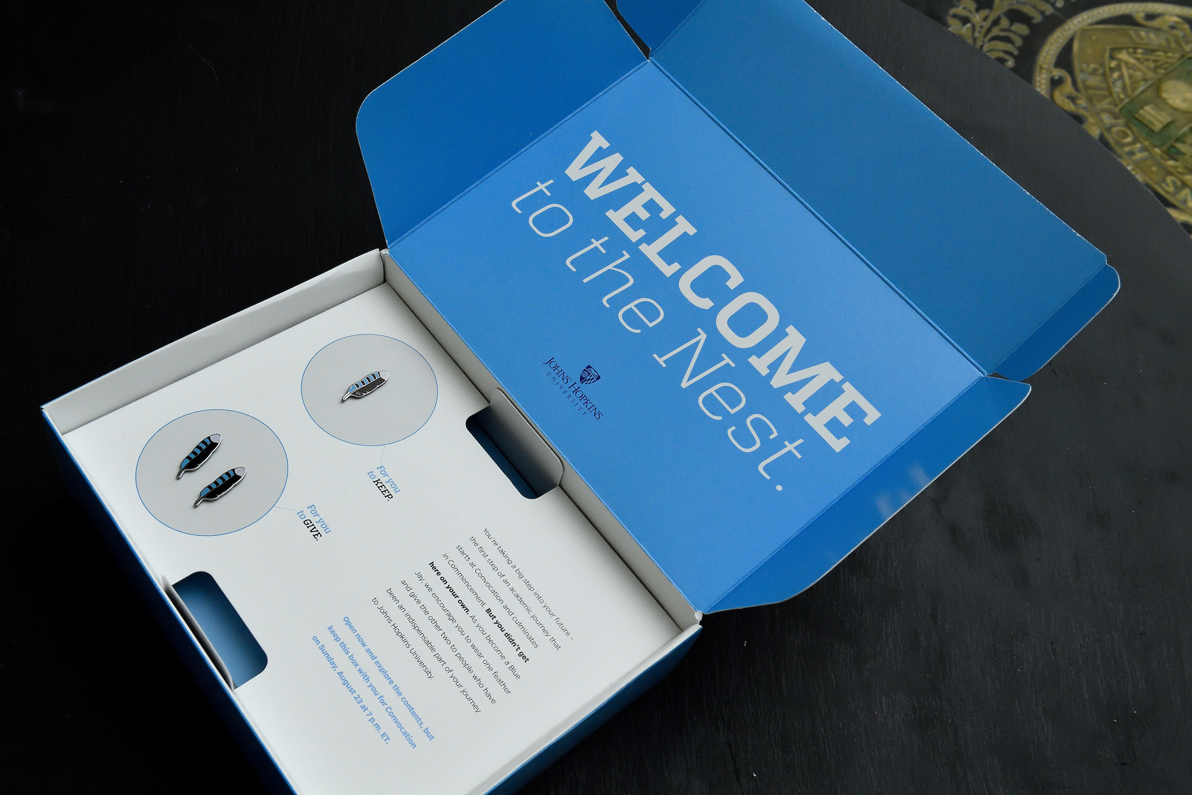
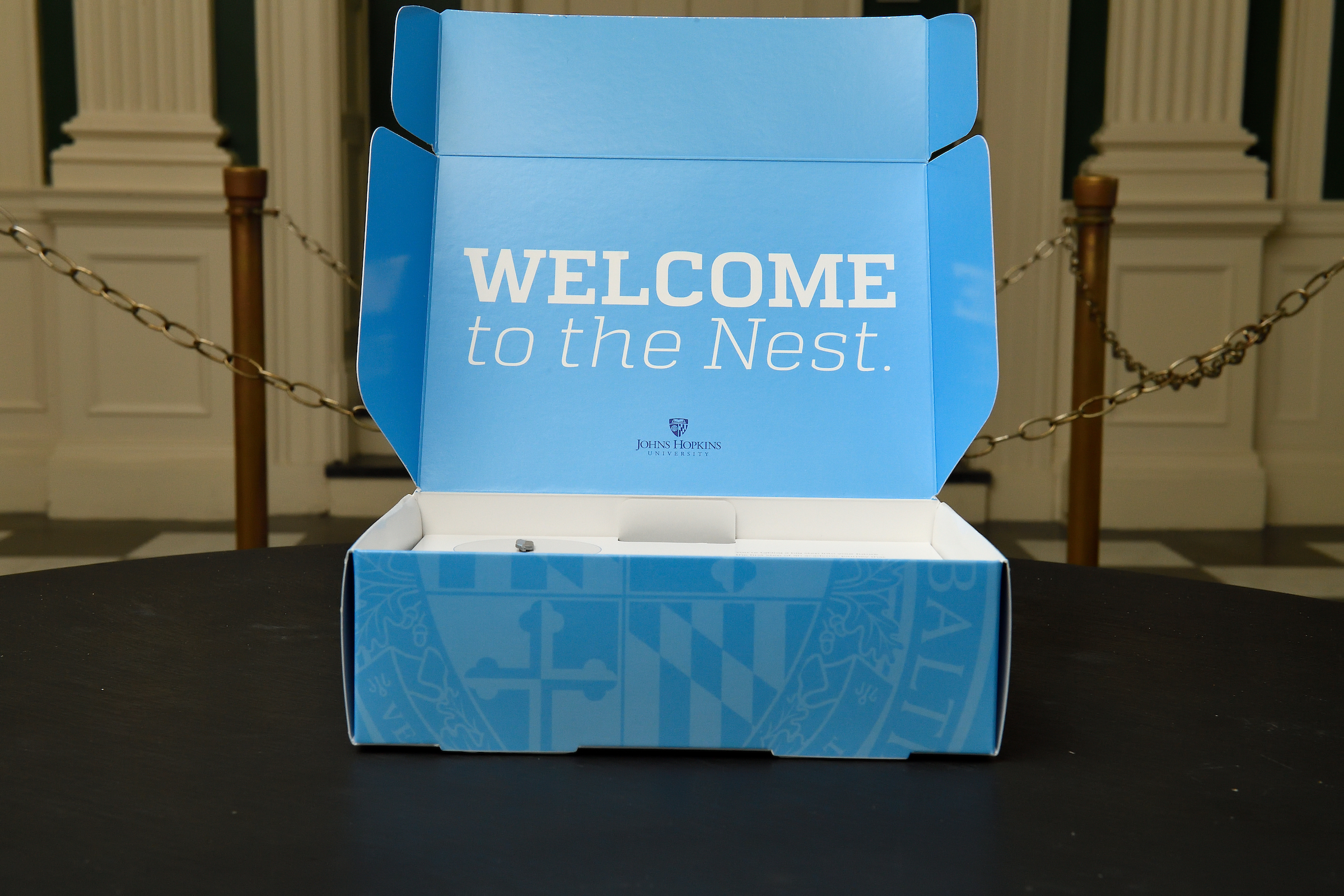
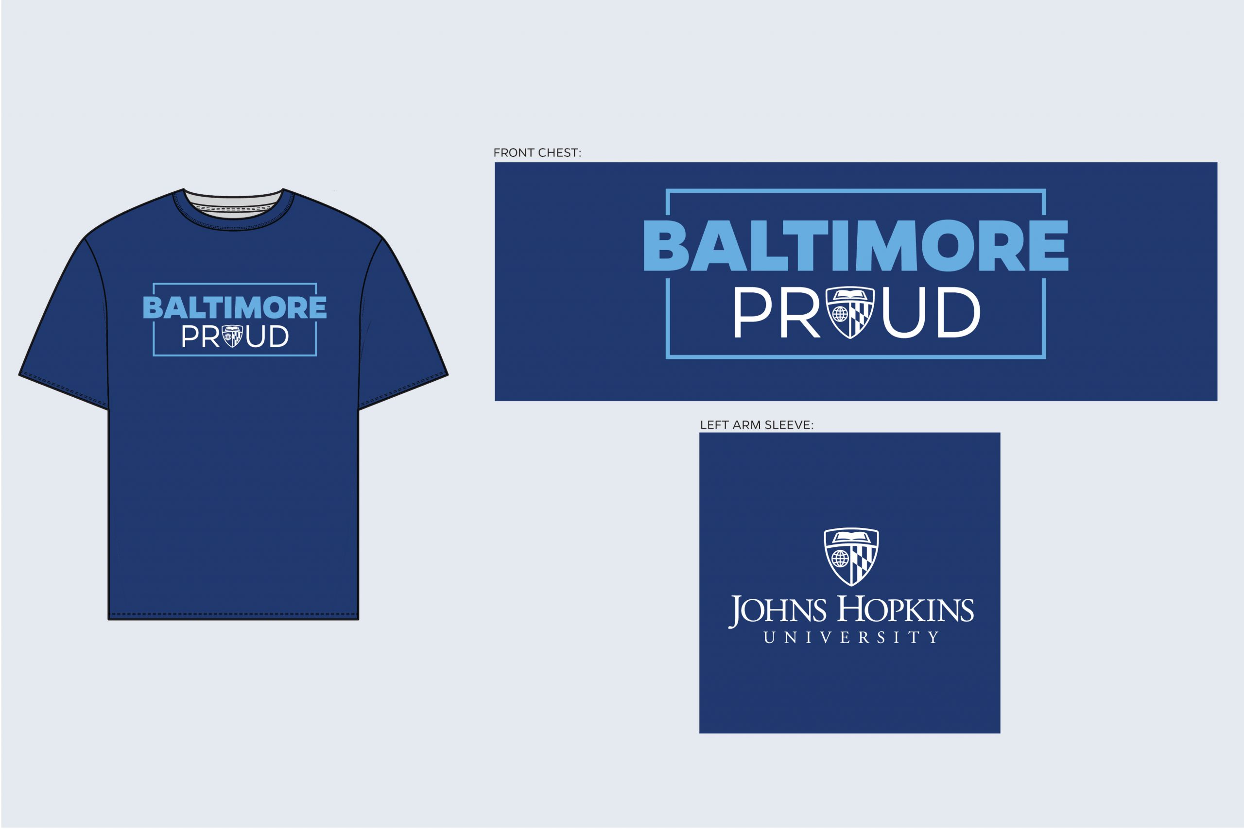

We’re excited to see what you create with Hopkins Slab! Don’t forget to submit your work to our Brand Showcase so you can inspire others.